
It took ten versions over two years and now it is done: the final book cover for Crossing Swords.
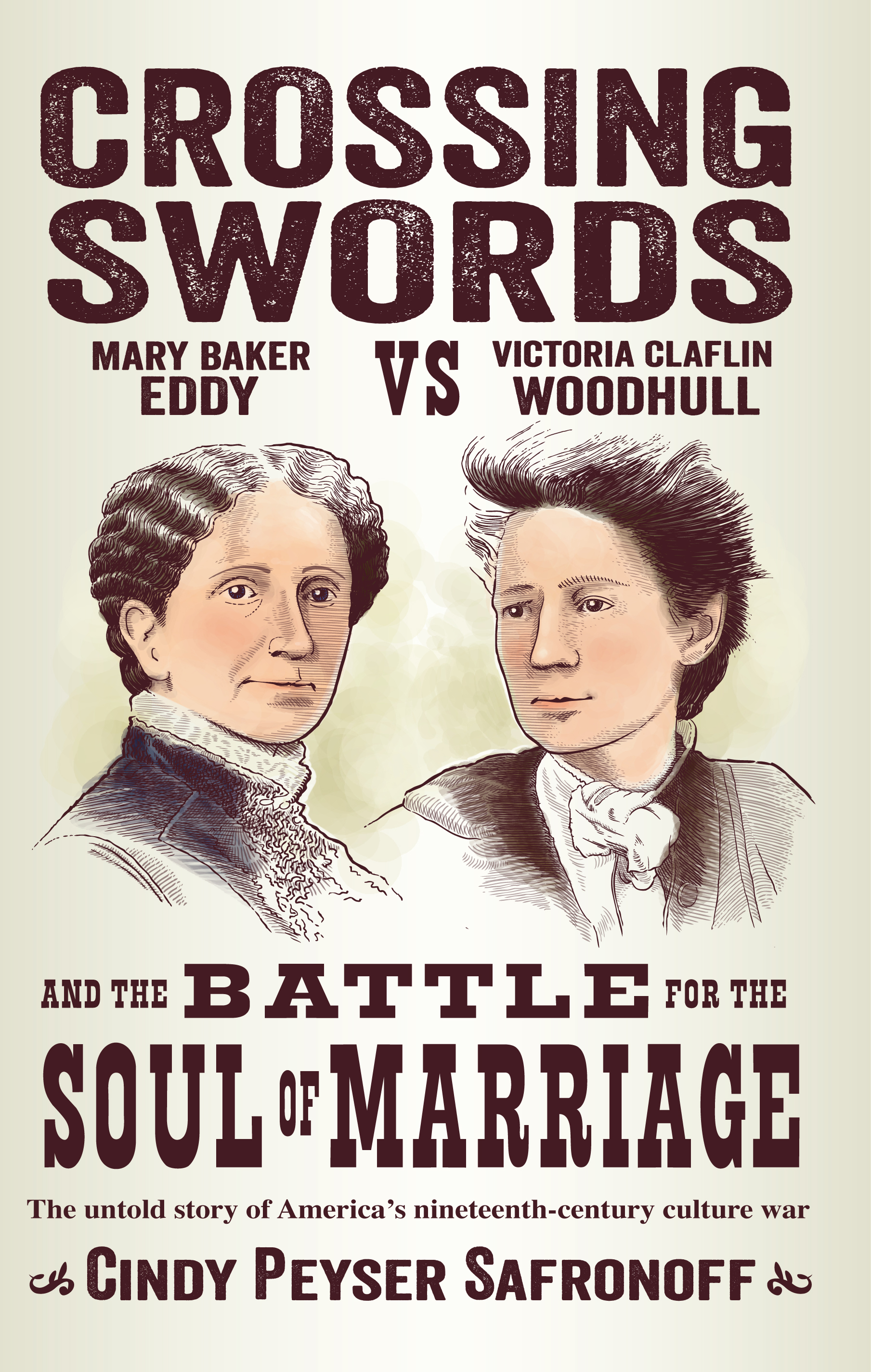
I wanted a cover that looked like an 1870s event flier or newspaper feature page. Originally I envisioned the cover almost completely black and white, but without actually using black or white. Working through many design iterations, artist Mark Peyser tried variations with more 19th-century styling flourishes and various headline fonts. We tried a combination of dark brown and dark red and line embellishments, to give a look similar to the Emancipation Proclamation commemorative postage stamp, which came out around the same time as that version of the cover. But in the end, simplicity of color theme and font style won out–achieving an old-fashioned look in a contemporary way–with a dark brown title over a light beige background, similar to the color of old newspapers!
I wanted to create an image for this “battle” which could be interpreted as light-hearted or deadly serious or anywhere in between. After several initial tries, Mark created these portraits of Eddy and Woodhull, which are each based on famous photographs, drawn in the style that was commonly used for illustrations in that era. Originally, their faces had the look of black and white like the headline-style titles, but Mark surprised me one day by colorizing their faces. Once I got used to the new look, I liked it better because it brought these women to life–as I have tried to do in my book.
This creative journey has been a long one, with many twists and turns. It’s fun to look back and see all the steps along the way, beginning with my first concept for the cover I created with standard Microsoft Word fonts and a sharpie pen. I posted each new version on my bulletin board, and spent time looking at it every day–and thought about what I wanted to change. I’m so pleased to finally have a cover that feels final!
I will fully admit to being a tough customer to work for. Thanks, Mark, for sticking with me on this project through so many tries, doing what it takes to get it right!